Table of Contents
Boost Your Facebook Ads with These 3 Creative MidJourney Post Ideas
Looking to supercharge your Facebook ads with visuals that truly captivate? Discover how MidJourney’s AI-powered design tool can help you create stunning, scroll-stopping images for your ads. In this guide, I’ll explore three key types of Facebook posts—feed ads, stories, and business covers—that pop, complete with step-by-step instructions and creative tips for each format. Learn how to seamlessly combine MidJourney’s AI art with Canva to craft ads that stand out in today’s crowded social media landscape. Ready to take your ads to the next level? Keep reading!
How to Create Eye-Catching Facebook Feed Images with MidJourney and Canva
Creating eye-catching Facebook feed images is a game-changer for boosting engagement. In this section, I’ll show you how to easily craft captivating visuals using two powerful tools: MidJourney and Canva. From generating custom, on-brand images in MidJourney to adding the finishing touches with text in Canva, you’ll learn how to create scroll-stopping content that drives interaction.
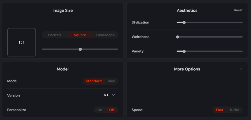
Let’s say we run a Cat Training Company and want to create engaging posts for our Facebook feed. First, head over to Midjourney.com and adjust the aspect ratio to 1:1, as illustrated below:
Next, enter a prompt on Midjourney.com to generate a new image that will help promote our Cat Training Company on Facebook:
Here is a Prompt Example: calm cat sitting on a scratching post, with a trainer offering a treat. The focus is on the cat’s relaxed behavior and the positive interaction with the trainer. Minimal background elements to keep the attention on the cat and trainer, with soft, natural lighting.
You can create even more prompts using ChatGPT! Here’s the result I got from Midjourney:

I chose the second image because I liked it, then upscaled it using the ‘creative’ option:
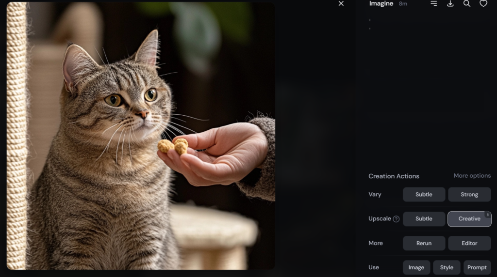
Here’s the upscaled result:

To save the image, simply right-click on it and select ‘Save Image’.
An easy way to add text to your image is by using Canva.com. Just head to the website and click on ‘Create a design’ to get started:

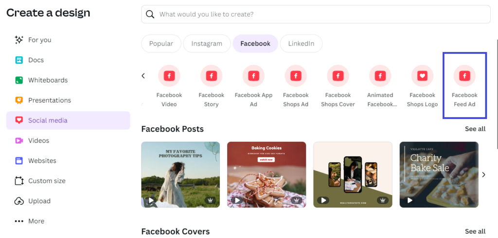
Next, choose ‘Facebook Feed Ad’ from the available options:
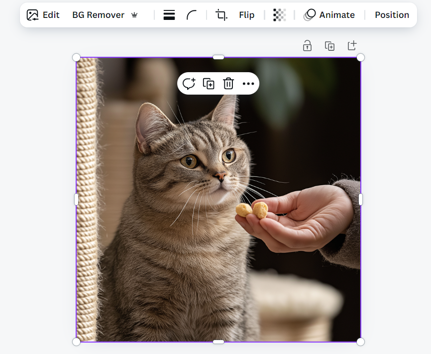
Afterward, drag your image onto the blank canvas and stretch it to fit. Hold ‘Alt’ while resizing to maintain the aspect ratio.
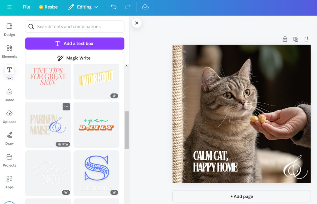
To add text, click on the ‘Text’ option in the left panel, then drag your preferred text style onto the canvas.
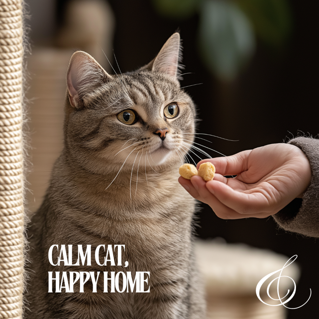
To save your design, click ‘Share’ and then select ‘Download.’ Here’s the final result:
How to Design Stunning Facebook Stories with MidJourney and Canva
Creating visually stunning and engaging Facebook Stories has never been easier, thanks to powerful tools like MidJourney and Canva. In this section, I’ll walk you through the step-by-step process of designing a captivating Facebook Story post. Whether you’re a small business or content creator, you’ll discover how to combine the artistic capabilities of MidJourney with the user-friendly design options in Canva to craft eye-catching visuals that boost engagement.
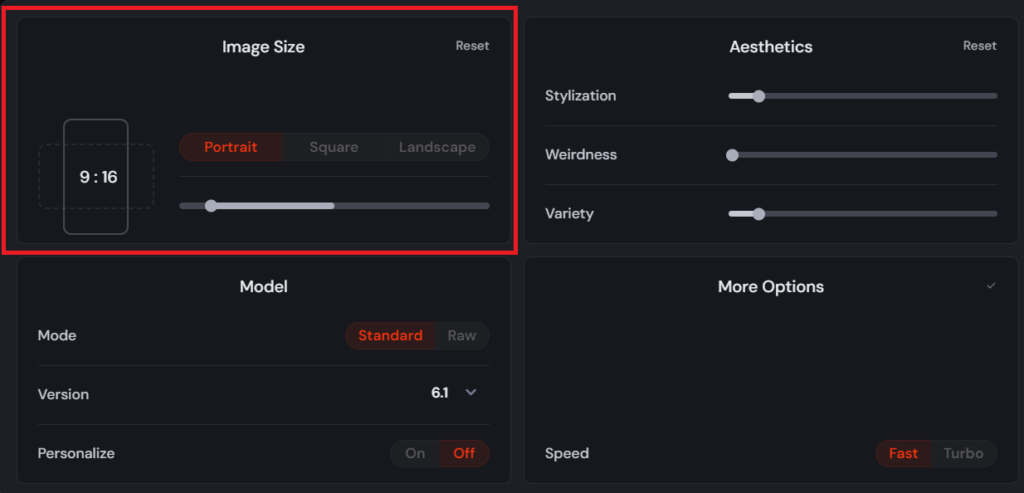
Building on our Cat Training Company example, let’s design a post specifically for Facebook Stories. First, head over to Midjourney.com and set the aspect ratio to 9:16:
Next, enter the following prompt on Midjourney.com:
Prompt example: Van Gogh style Painting of a cat calmly sitting on a scratching post with a trainer nearby offering a treat. Soft brush strokes, minimal background with hints of furniture, warm indoor lighting, and a sense of tranquility.
If you need more prompt ideas, don’t hesitate to ask ChatGPT!
Here’s the result after entering the prompt:
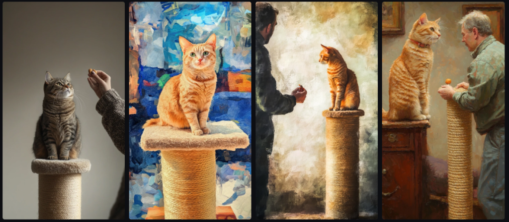
I like the second image, so I’ll go ahead and upscale it:
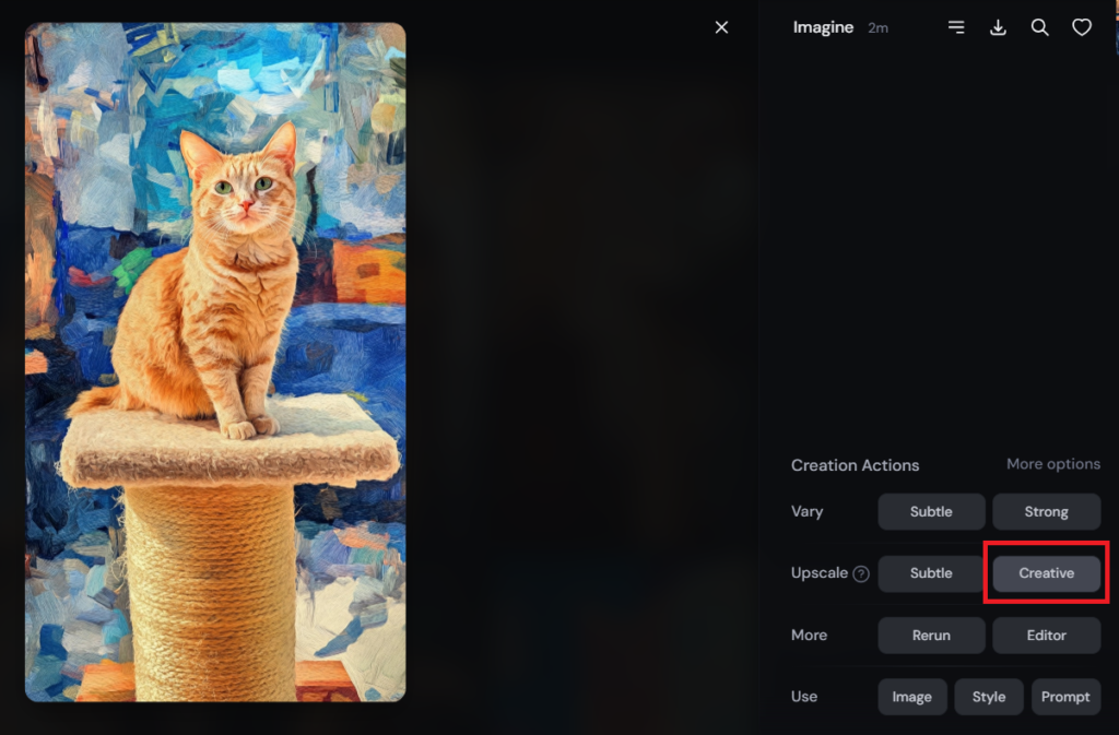
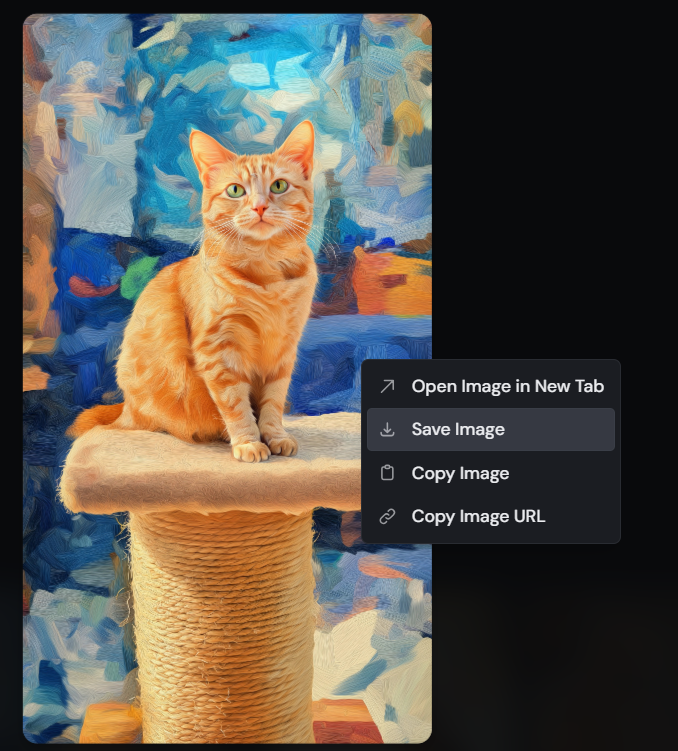
To save the upscaled image, simply right-click on it and select ‘Save Image’ to download it:
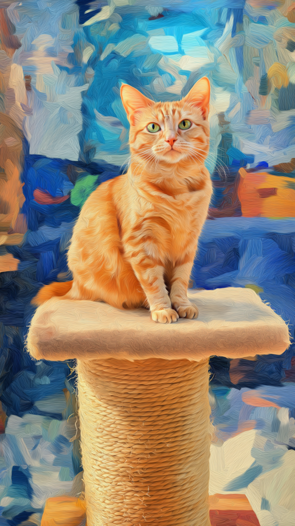
Here’s the final upscaled image:
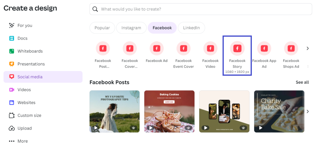
Next, go to Canva.com and choose ‘Facebook Story’ as your design format.
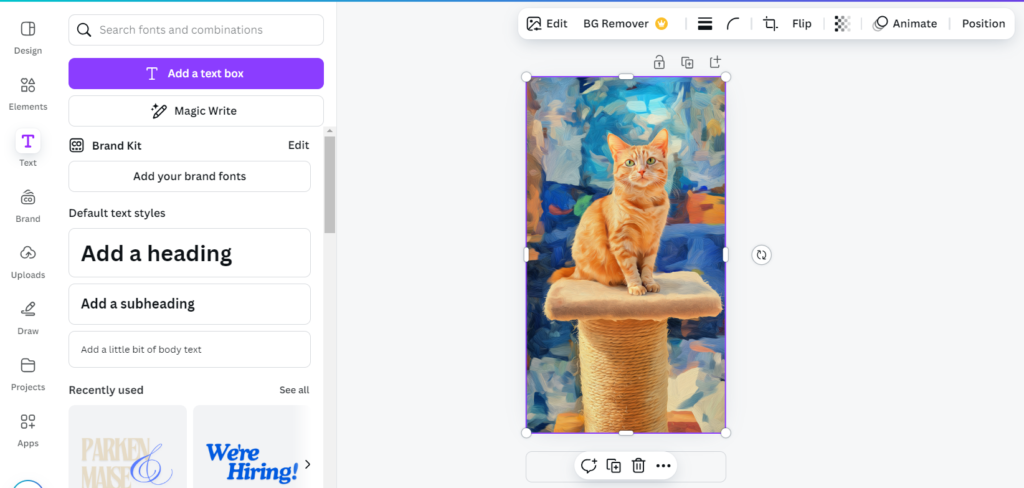
Then, drag and drop the downloaded image onto the canvas. Hold ‘Alt’ while resizing to scale it proportionally and fit the Canva dimensions.
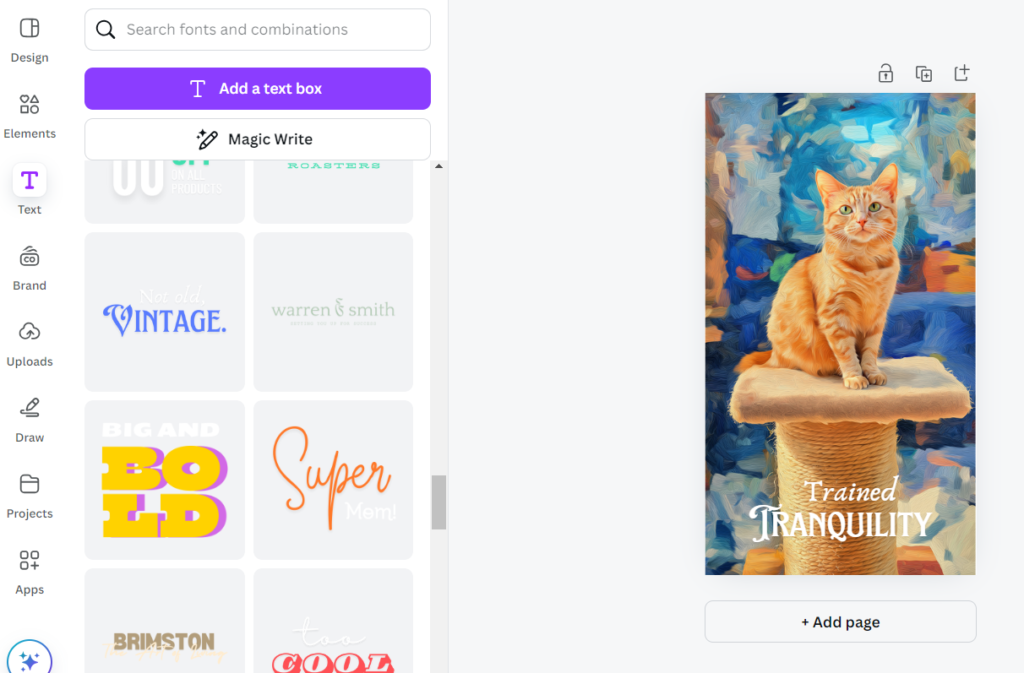
Finally, let’s add some text to finish the design:
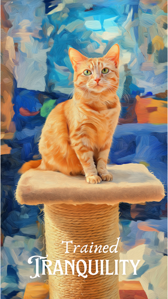
To download the image, click ‘Share’ and then choose ‘Download.’ Here’s the final result:
How to Create Stunning Facebook Business Page Covers with MidJourney in Minutes
Designing a captivating Facebook Business Page cover doesn’t have to be a lengthy or complicated process. With AI tools like MidJourney, you can create stunning, professional-quality covers in just minutes, even if you have no graphic design experience. Whether your goal is to grab attention with striking visuals or showcase your brand’s unique personality, MidJourney makes it easy to generate breathtaking images that will leave a lasting impact. In this section, I’ll show you step-by-step how to use MidJourney and Canva to design a Facebook cover that truly sets your page apart. Let’s get started!
Now, let’s create a business page cover using Midjourney. Start by setting the aspect ratio on Midjourney.com:
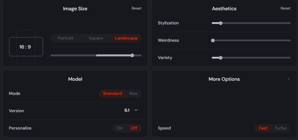
Now, enter the following prompt as an example. You can also use ChatGPT for more prompt ideas:
Prompt Example: A panoramic watercolor painting of a sailboat gliding across a calm ocean, with a golden sunset casting warm, vibrant hues across the sky and water, reflecting soft light and gentle waves.
Here’s the result after entering the prompt in Midjourney:
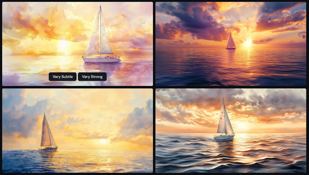
I like the third one, so I’ll click ‘Upscale’ as shown below:
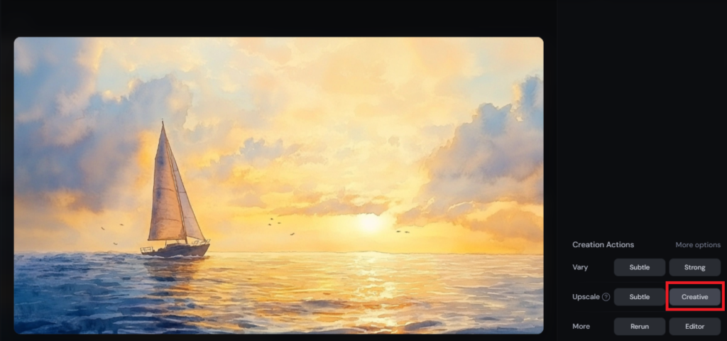
To save the image, right-click and select ‘Save Image’. Here’s the upscaled version:

To add text to the image, head over to Canva.com and click on ‘Create a design’:
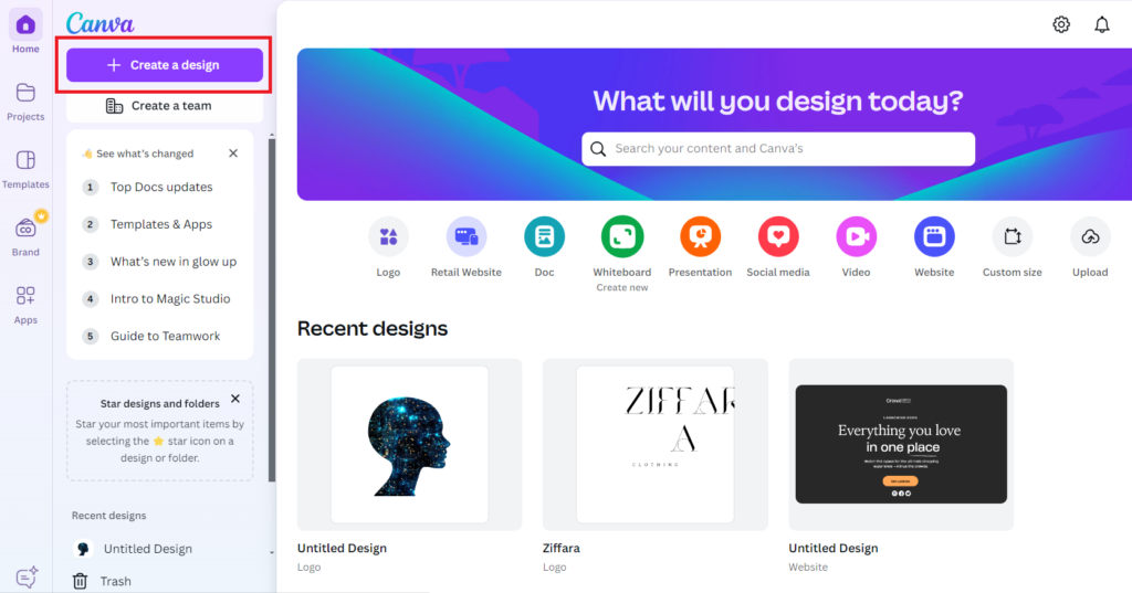
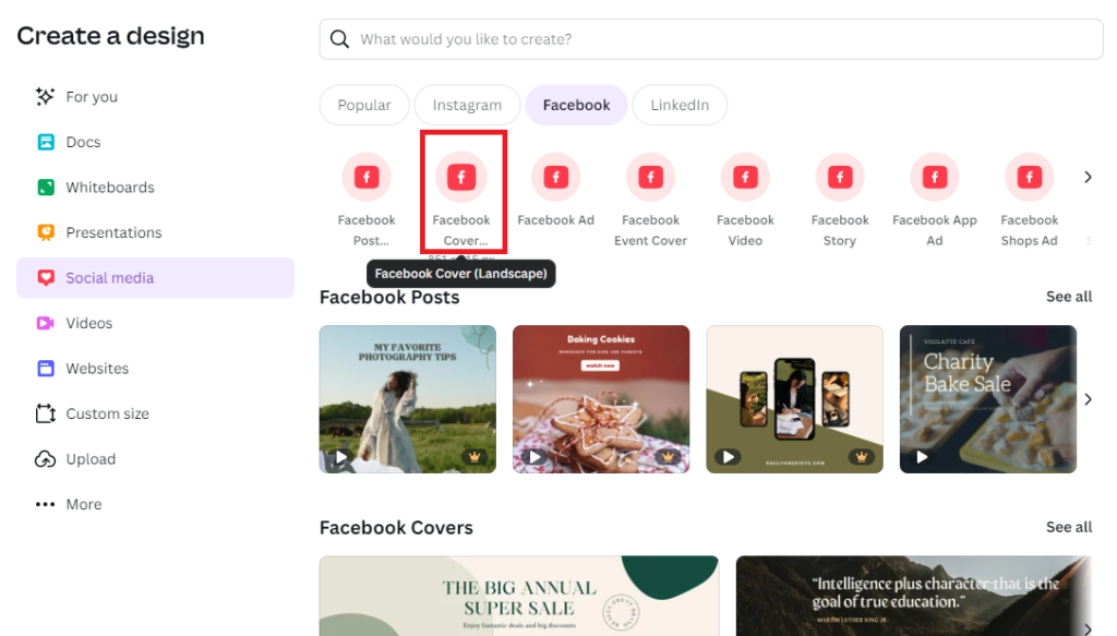
Next, in the Social Media tab, select ‘Facebook Cover (Landscape)’:
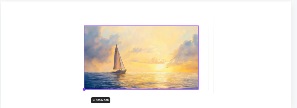
Drag and drop the downloaded image onto the Canva canvas. Hold the ‘Alt’ key while resizing to maintain the aspect ratio and position:
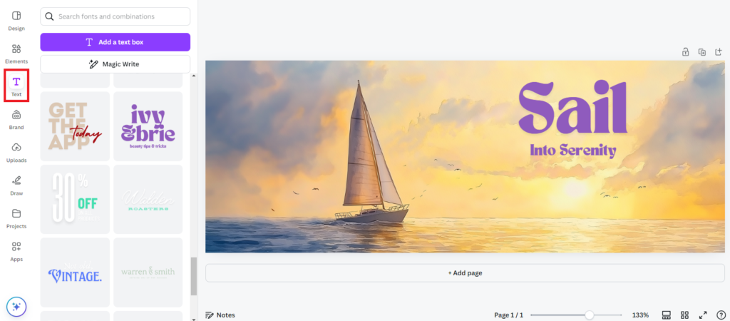
You can add any text you like by using the ‘Text’ option in the left panel:
To download the image from Canva.com, click ‘Share’ and then select ‘Download.’ Here’s the final result:

Best Practices for Facebook Ad Copy Placement

When it comes to Facebook ads, copy placement plays a significant role in driving engagement and conversions. It’s not just about writing compelling text, but strategically placing it for maximum impact. Here are some best practices for Facebook ad copy placement to help your campaigns perform their best:
- Front-Load Your Value Proposition: Facebook users scroll quickly, so capturing attention early is key. Place your strongest value proposition at the very start of your ad copy. Whether it’s a limited-time discount or a unique benefit, ensure it’s in the first few lines, where it won’t get truncated by Facebook’s “See More” button. This keeps your primary message visible, even if users don’t expand the text.
- Utilize Headline Space Wisely: The headline is one of the most prominent pieces of text in your Facebook ad. It should clearly convey what you’re offering and why it matters. A good rule of thumb is to keep it concise, focusing on a benefit or a solution. Think of it as a mini CTA (Call to Action)—this is where you tell users exactly why they should care about your product or service.
- Pair Strong Copy with a CTA in the Description: The ad description, which appears below your headline, is the ideal spot for additional details or a secondary call to action. It’s a great place to reinforce your message or highlight a specific feature of your product. Keep this area concise and focused, making sure it aligns with the rest of your ad’s messaging.
- Leverage the Power of Short vs. Long Copy: Understanding when to use short copy versus long copy is crucial. Shorter ads tend to work better for direct offers, like a sale or product launch, where the value is clear and the decision-making process is quick. Long copy works better when you’re offering something that requires more education or trust-building, such as a complex product or service. Consider using long-form copy in carousel ads, where each card can feature a distinct benefit or testimonial to guide the user through the journey.
- Avoid Copy Overload in Images: If your Facebook ad includes images or video, avoid overloading them with too much text. Facebook penalizes ads with excessive text on visuals, leading to less reach. Instead, let the image capture attention while your copy drives the message home in the designated text areas.
Incorporating MidJourney’s AI-powered tools into your Facebook ad strategy opens up limitless creative possibilities. Whether you’re designing feed posts, stories, or business page covers, MidJourney’s dynamic visuals combined with Canva’s user-friendly features make crafting scroll-stopping ads easy and impactful. By using these innovative tools, you’ll not only enhance your brand’s visual appeal but also drive engagement and conversions. Ready to elevate your Facebook ads with stunning visuals? Dive into MidJourney and watch your ads come to life like never before!

